🚀 Astro 5 + Shadcn/UI + Tailwind v4 Starter Kit
A lightning-fast starter template combining Astro’s performance with Shadcn’s beautiful components and Tailwind CSS v4’s modern CSS-based configuration.
✨ What’s Inside
- Astro 5.14+ - Lightning-fast static site generation
- React 19 - Latest React with improved performance
- Tailwind CSS v4 - Modern CSS-based configuration
- Shadcn/UI - Complete component library (40+ components)
- TypeScript - Full type safety
- Dark Mode - Beautiful theme switching
- 100/100 Lighthouse - Perfect performance scores
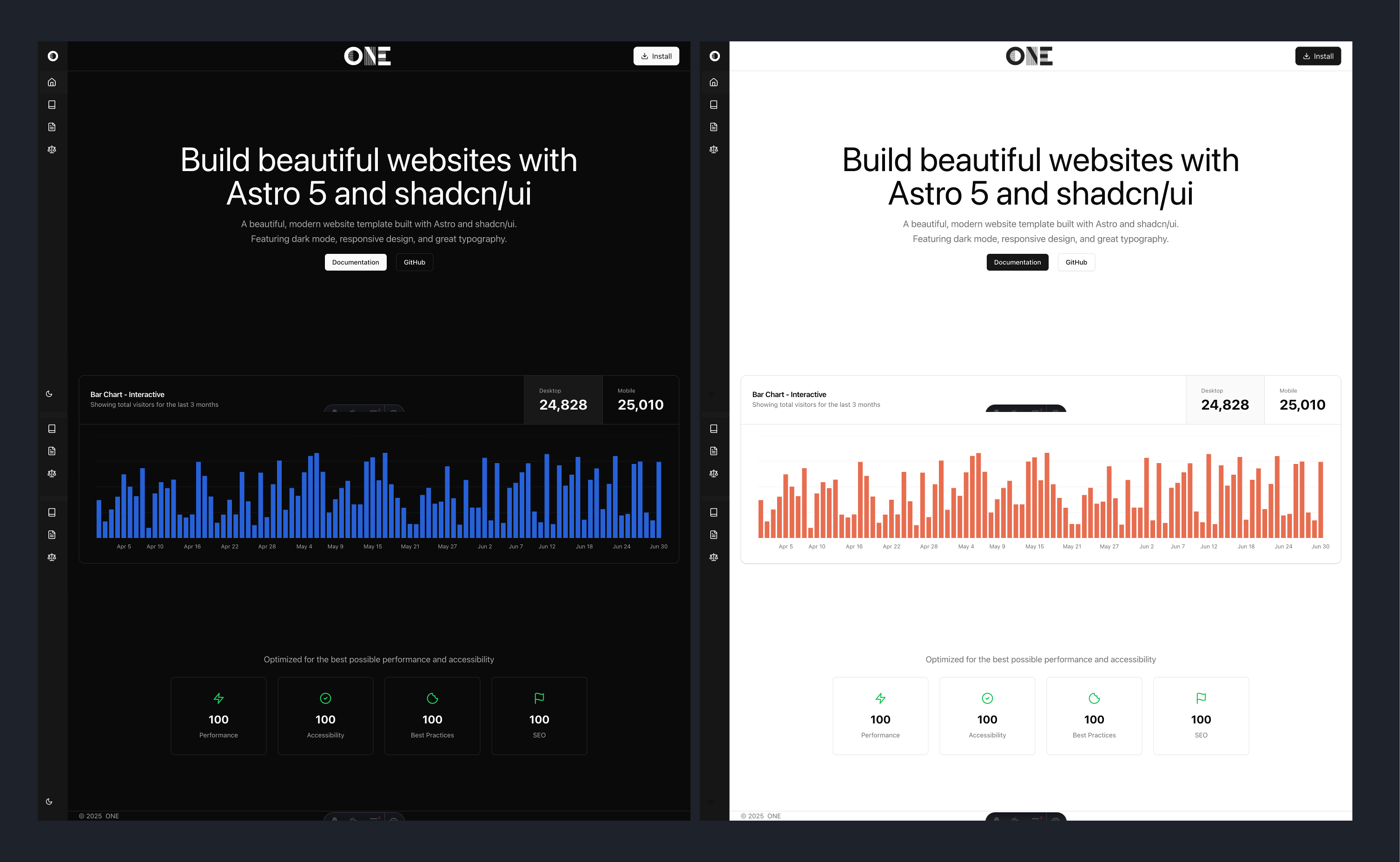
🎨 Screenshots
⚡ Quick Start
# Clone the repository
git clone https://github.com/one-ie/astro-shadcn.git

# Navigate to project
cd astro-shadcn

# Install dependencies
npm install

# Start development server
npm run dev
Visit http://localhost:4321 - You’re ready to go! 🎉
🎨 Pre-installed Components
All Shadcn/UI components are pre-configured for Astro:
---
// Example usage in .astro file
import { Button } from "@/components/ui/button"
import { Card } from "@/components/ui/card"
---

<Button>Click me!</Button>
Available Components
- ✅ Accordion
- ✅ Alert Dialog
- ✅ Avatar
- ✅ Badge
- ✅ Button
- ✅ Card
- ✅ Dialog
- … and more!
🛠️ Project Structure
your-project/
├── src/
│   ├── components/
│   │   └── ui/          # All Shadcn components (40+)
│   ├── layouts/
│   │   └── Layout.astro # Base layout with theme support
│   ├── pages/
│   │   └── index.astro  # Homepage
│   └── styles/
│       └── global.css   # Tailwind v4 config with @theme blocks
├── astro.config.mjs     # Astro + @tailwindcss/vite config
└── components.json      # Shadcn/ui configuration
Using Components
---
// src/pages/index.astro
import { Button } from "@/components/ui/button";
import { Card, CardHeader, CardTitle } from "@/components/ui/card";
---

<Card>
  <CardHeader>
    <CardTitle>Welcome to Astro + Shadcn!</CardTitle>
  </CardHeader>
  <Button client:load>Interactive Button</Button>
</Card>
🚀 Development Workflow
-
Start Development
npm run dev -
Using React Components in Astro
--- // Always add client:load for interactive components import { Dialog } from "@/components/ui/dialog" --- <Dialog client:load> <!-- Dialog content --> </Dialog> -
Build for Production
npm run build
npm run preview # Test the production build
🔍 Troubleshooting
Common Issues Solved
✅ Component Hydration: All interactive components use client:load
✅ Build Warnings: Suppressed in configuration
✅ Path Aliases: Pre-configured for easy imports
✅ React Integration: Properly set up for Shadcn
💡 Pro Tips
-
Component Usage in Astro
--- // Always import in the frontmatter import { Button } from "@/components/ui/button" --- <!-- Use in template --> <Button client:load>Click me!</Button> -
Styling with Tailwind v4
<!-- Use semantic color names that work in both light and dark modes --> <div class="bg-background text-foreground border border-border"> <Button class="m-4">Styled Button</Button> </div> -
Layout Usage
---
import Layout from '../layouts/Layout.astro';
---

<Layout title="Home">
  <!-- Your content -->
</Layout>
📊 Performance & Screenshots
⚡ Lighthouse Scores
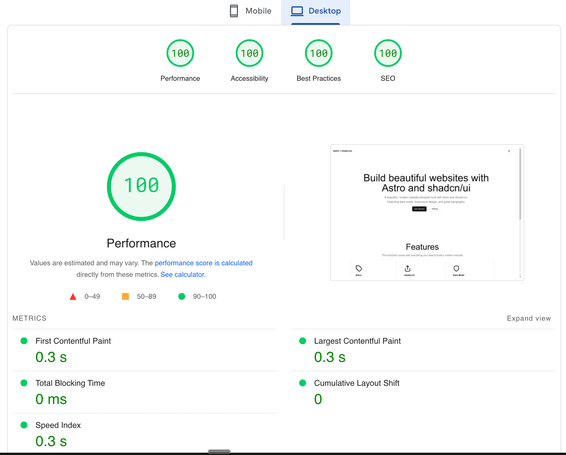
Perfect scores across all metrics:
- 🚀 Performance: 100
- ♿ Accessibility: 100
- 🔧 Best Practices: 100
- 🔍 SEO: 100
📚 Quick Links
🤝 Need Help?
- Join Astro Discord
- Check Astro Documentation
- File an Issue on GitHub
Built with 🚀 Astro 5, ⚡ Tailwind v4, ⚛️ React 19, and 🎨 Shadcn/UI by ONE